

7UICE FOUNDATION
A scalable, inspiring, & mission-driven brand identity
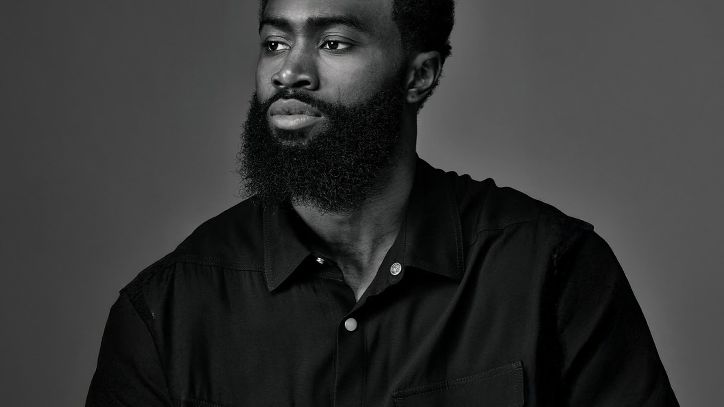
(Client)7uice Foundation
(Year)2024
(Services)Branding, Spec Work
CHARGE
FORWARD
The 7uice Foundation needed a brand identity that could grow beyond Jaylen Brown's personal brand while staying true to its mission of empowering underserved communities. I created a kinetic identity system built around energy and movement that scales from grassroots initiatives to national partnerships.

Some context
Jaylen Brown founded the 7uice Foundation on the belief that opportunity should be universal. The foundation focuses on youth development, financial literacy, and community impact, providing resources and programs that break barriers and build real pathways forward. But as the foundation evolved and grew its reach, it needed an identity that could stand independently while maintaining the energy and purpose that drives its mission.
The strategy
The challenge was to create a brand that felt as dynamic and urgent as the work itself. The foundation isn't just a nonprofit—it's a movement. So I built an identity system rooted in energy and motion, designed to feel kinetic and electric across every touchpoint. The brand needed to be ownable, scalable, and culturally resonant while capturing the raw momentum behind the mission.

The logo
The "7" became our power symbol—a bold, ownable mark that integrates a lightning bolt motif, reinforcing both power and progress. This isn't just a number; it's an icon that represents the energy and forward momentum the foundation brings to every community it touches.


Typography
The Pipe typeface family brings geometric precision with a human touch. Its clean lines and balanced proportions make it approachable without losing sophistication. Built for versatility, Pipe works just as well in bold headlines as it does in detailed text, giving the 7uice Foundation a voice that's both strong and accessible.

Kinetic elements + Surge
The kinetic element system brings energy, motion, and texture to brand assets. Inspired by the pulse of progress and the raw momentum behind the foundation's mission, these dynamic shapes form a flexible visual language that adapts across platforms while maintaining that sense of constant forward motion.
Surge represents momentum, ambition, and the pursuit of progress. The figure reaches for the same lightning bolt that lives in the 7uice logo, creating a visual metaphor for the foundation's core mission: creating access, fueling opportunity, and pushing forward.


A system in action
Here's where all the pieces come together. The identity system flexes across different needs—community events, digital campaigns, program materials—while keeping that kinetic energy alive. It's built to move with the foundation as it grows, always feeling urgent and purposeful no matter where it shows up.


